Webfont Optimization
The world of web fonts is like a beauty salon — we all want the best, but not always willing to wait for the stylist to finish. And your visitors? They’re especially impatient.
When fonts load slowly, users don’t see your carefully chosen text; they only see a blank page or jarring content shifts. It can feel like your site was built by a Friday-afternoon intern.
Let’s look at how to turn web fonts into an advantage rather than a speed bottleneck.
Why optimize fonts at all?
Fonts aren’t just an aesthetic concern. They are digital data that users must download before they can see your text. Since text is often one of the first things visitors want to see, fonts directly affect two key metrics:
- LCP (Largest Contentful Paint) - the time when the largest visible content on the page is painted. Often the text is waiting for the font.
- CLS (Cumulative Layout Shift) - how much content “jumps” during loading. If the font loads late, text can suddenly change size and disrupt the layout.
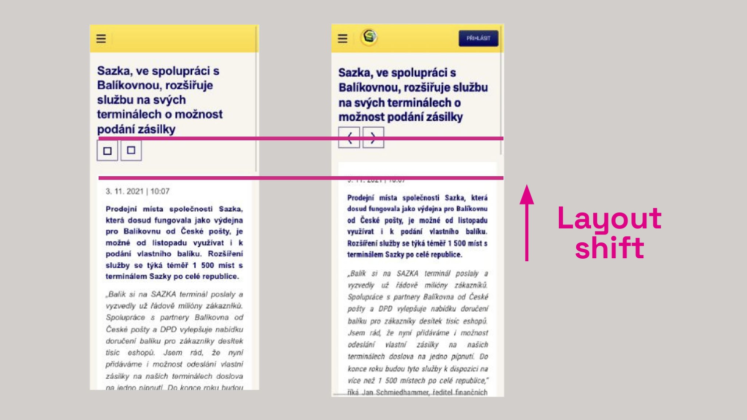 CLS isn’t a mysterious acronym; it’s a jolt to users right as they’re about to read. (From our font optimization work for Sazka.cz)
6 steps on the path to fonts that won’t slow your site down
1. WOFF2: the only format you need today
If your fonts still travel the web in outdated formats like TTF or EOT, it’s time to upgrade.
WOFF2 offers up to 30% better compression than older formats and is supported by all modern browsers.
@font-face {
	font-family: 'MyFont';
	src:
		url('myfont.woff2') format('woff2'),
		url('myfont.woff') format('woff'); /* For browsers from the Jurassic era */
}
If you’re concerned about very old browsers, you can also use the WOFF format as in the snippet, though it isn’t strictly necessary.
2. Subsetting: don’t burden users with glyphs they’ll never see
Most fonts include hundreds or thousands of glyphs for various languages. If your site mostly uses Czech text, why force visitors to download support for Chinese or Arabic?
With Glyphhanger you can create a lean version of the font containing only the glyphs you actually use. The result? Font data can be up to 10x smaller.
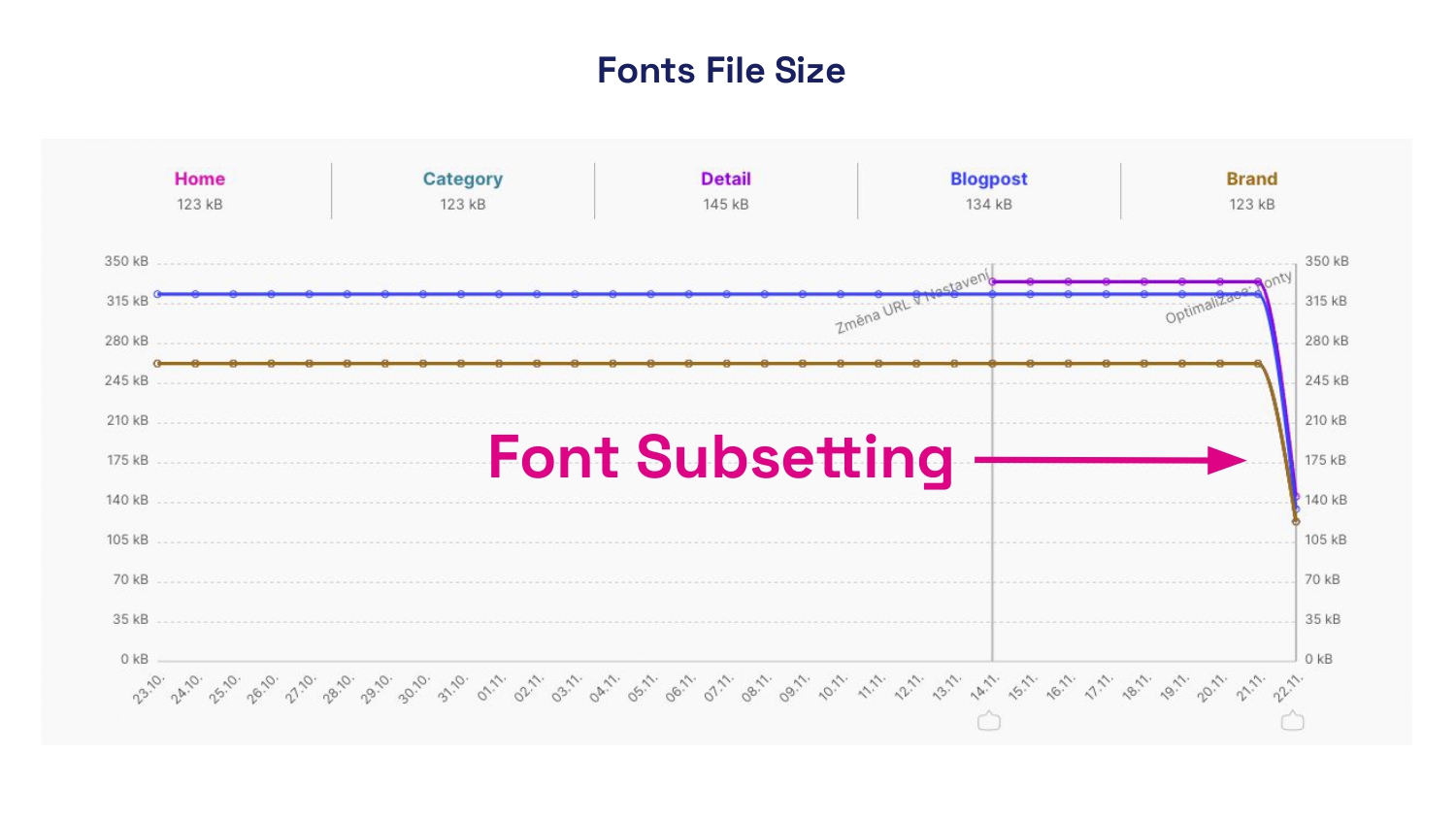 A real-world story: using subsetting and reducing font cuts saved hundreds of percent in font data on Trenýrkárna.cz. You’ll notice the difference from the very first visit.
For multilingual sites you can prepare language-specific subsets and load them conditionally based on the page language. This is also something we do in PageSpeed.cz in our speed analyses.
3. Preload critical fonts: prioritizing what users see first
Some fonts matter more than others. The font for headings (H1) or body text visible above the fold deserves faster loading.
Use the preload instruction to tell the browser: “Load this as soon as possible”:
<head>
	<link rel="preload" href="critical-font.woff2" as="font" type="font/woff2" crossorigin />
</head>
Note: Use preload only for truly critical fonts. Each preload consumes a portion of your site’s speed budget.
4. Stop the jumping text: control font-display
The [font-display] property determines how the browser behaves while waiting for the font to load. You have several options:
swap- text initially renders with a fallback system font and then swaps to the web font once loaded. Fast, but can cause CLS.fallback- a short period of “invisibility,” then a system font, and if the web font loads in time, it will be used.optional- the browser decides whether to download and use the font. Suitable for less critical fonts.
@font-face {
	font-family: 'MyFont';
	src: url('myfont.woff2') format('woff2');
	font-display: fallback; /* adjust as needed */
}
Also choose a suitable fallback font with metrics close to your web font to minimize content jumps when switching.
5. Variable fonts: one file to rule them all
If you’re using one font with three weights, the traditional approach downloads three separate files.
Variable fonts let you pack multiple weights into a single file, dramatically reducing total font data.
@font-face {
	font-family: 'VariableFont';
	src: url('var-font.woff2') format('woff2-variations');
	font-weight: 100 900; /* supported weight range */
}

.bold-text {
	font-weight: 700;
}

.regular-text {
	font-weight: 400;
}
6. What you don’t measure, you don’t improve
How can you know if fonts are slowing your site? Use Lighthouse in Chrome DevTools or our PageSpeed PLUS monitoring, which shows how font data volume and font usage impact LCP and CLS.
Site speed isn’t a one-off effort. With every new feature, image, or font you add, speed can change. Our PageSpeed PLUS monitoring continuously tracks your site’s performance and alerts you when metrics begin to worsen.
In DevTools you can watch font loading in the Network tab, filtering by type “Font.”
Don’t underestimate font optimization
Font optimization isn’t just a technical detail — it’s an investment in user experience, SEO, and conversions. With properly optimized fonts your site will look great, load quickly, and deliver a smooth experience to visitors on any device or connection.
Tags:DOMOptimizationHTML
PreviousDOM Optimization: The Foundation of Speed and SEONextGzip and Brotli Compression