CLS: How to Keep Element Heights (Images, JS Components, Iframes…)
In this article you’ll learn why and how to guarantee dimensions for elements that are loaded asynchronously into a page, such as <img>, <iframe>, or JavaScript components, at the HTML or CSS level.
Properly reserving space for these elements helps you avoid unwanted layout shifts and thus preserves the Cumulative Layout Shift (CLS) metric, which is part of the Core Web Vitals suite.
Why you should monitor dimensions and aspect ratio?
Every asynchronously loaded element on a page should have a defined size. This can be an image, video, iframe, or another web component.
When the page loads and the first content is displayed (the FCP event), the browser, before showing this element, needs to have space defined for it.
Let’s look at solutions for specific elements in more detail.
1. Images, IMG elements
The most common CLS problem is missing dimensions for images. The browser knows nothing about an image until it has fully downloaded and rendered it. If you specify width and height attributes on the <img> tag, the browser will allocate the needed space for the image.
<img src="image.webp" alt="…" width="1600" height="900" />
For the width and height attributes, prefer the image’s actual physical dimensions in pixels.
Dimensions also allow deriving the aspect ratio, so this works for images in responsive layouts. If possible, always provide dimensions for images. This is especially important for images loaded lazily with loading="lazy".
Sometimes you may not be able to generate width and height attributes in HTML for technical reasons. This can be replaced with the CSS property aspect-ratio, which reserves space using the aspect ratio.
If you don’t know the dimensions or aspect ratio ahead of time for images, you can use the trick with an automatic aspect ratio.
.wysiwyg img {
	aspect-ratio: auto 16 / 9;
}
This aspect-ratio setting ensures that each image gets a 16:9 aspect ratio, but after the image finishes loading and rendering the browser will respect the image’s actual ratio.
It’s better to reserve some space than to have no dedicated space at all.
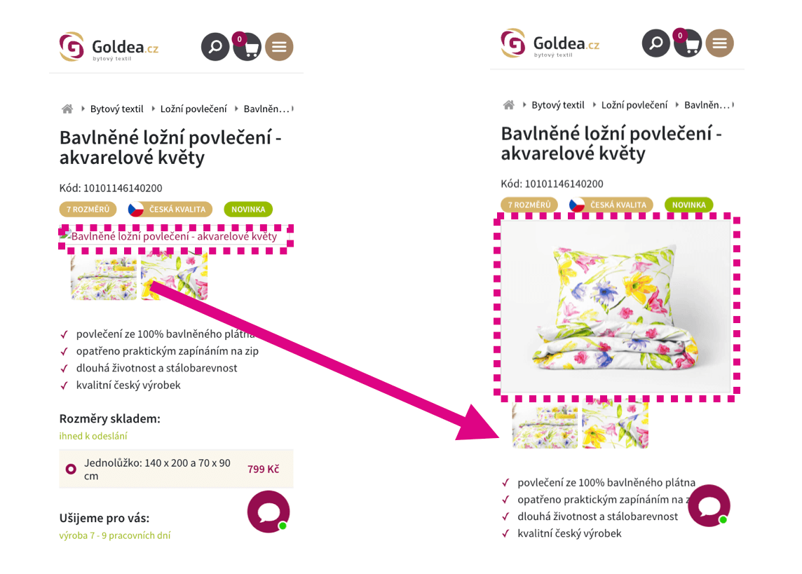 An image that lacks defined dimensions is first rendered with the wrong height, then pushes content down, causing a layout shift.
2. JavaScript components on your site
This can include calculators, image gallery slideshows, carousels with offers, and similar. These elements may not render immediately in the initial render, and their display might be deferred, for example via lazy loading or by loading content asynchronously with JavaScript.
Always reserve space in the layout ahead of time. If content is loaded later via JavaScript, prepare space for the element using the CSS property aspect-ratio or a min-height in your stylesheet.
When the aspect ratio is known:
.box {
	aspect-ratio: 16 / 9;
}
When the aspect ratio is unknown, provide an estimated minimum height:
.box {
	min-height: 200px;
}
3. Third-party JavaScript components
Typically this includes social plugins like Instagram, Facebook, TikTok, Google reviews, YouTube video, etc.
These widgets often don’t render immediately on the first render, but their display is deferred similarly to the components above.
Always reserve space in the layout ahead of time for these elements as well. If you don’t know the ratio or exact dimensions, at least apply min-height to provide a minimum height.
Check the rendering with a representative post and set the minimum height for this component accordingly. It’s better to reserve some space than none at all. You might not eliminate all layout shifts, but you’ll significantly reduce their impact on CLS.
 If you use the Google Reviews widget, reserve space for it on the page before loading the data.
How to test missing dimensions or aspect ratios
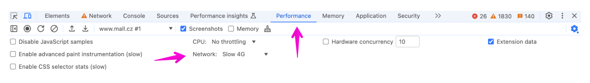
1. Local measurement with Chrome DevTools
Use the Performance panel to monitor live CLS changes. The panel also shows what’s causing the problem.
In this scenario, it’s helpful to throttle the network in the settings. Slowing resources down helps reveal images and components without dimensions more quickly.
2. Synthetic tests with Lighthouse
Synthetic tests with Lighthouse, which you can also run in our speed monitoring service PLUS, indicate which images lack dimensions and may cause CLS issues.
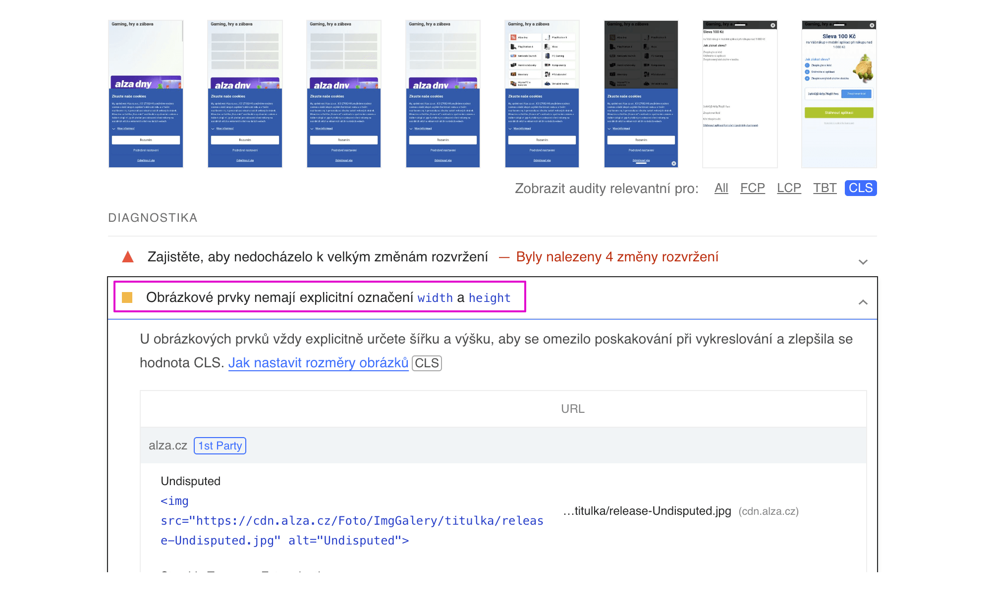 Lighthouse results show the impact of elements in the visible portion of the screen on CLS.
In the test run detail of our speed monitoring PLUS you can see Lighthouse report results and identify which elements affect CLS.
Providing height or aspect ratio is a fundamental method to avoid unwanted page shifts and degrade of the Cumulative Layout Shift (CLS) metric.
In our guide you’ll also find other methods for optimizing CLS.