Domains Report
The Domains report shows the speed status of measured domains. It’s the go-to report for tracking how the overall site speed is evolving.
It will answer all of these questions:
- Where do we stand right now?
- What is the trend of the metrics?
- Have optimizations paid off?
- Did site changes impact speed?
Before you dive in, keep in mind the following:
- All data in this report come from Google’s Chrome UX Report (CrUX). It’s important to understand the differences between measurement types (synthetic, CrUX, and RUM).
- You should also know how we measure web speed in our monitoring.
- We strongly recommend properly configuring the measured domains. You can include domains for your language variants or even competitors.
Ready? Let’s move on.
Differences between Free Tests and PLUS Tests
Differences in the Domains report are as follows:
- Free tests allow measuring up to 3 domains per test. PLUS tests support 5 or more (for an additional fee).
- Free tests show only monthly or 3-month history (if you’re logged in). PLUS tests show up to 12 months of history.
- PLUS tests also include a Navigation Types report.
For professional speed measurement, we recommend PLUS tests.
Relationship between the Watchdog and Domains reports
You may already know that the Watchdog report is the main tool for tracking potential improvements or deteriorations in metrics, hence speed.
That said, the Domains report remains essential. Its main advantage is that it tracks data from real users (CrUX). Watchdog collects only synthetic data from measured URLs.
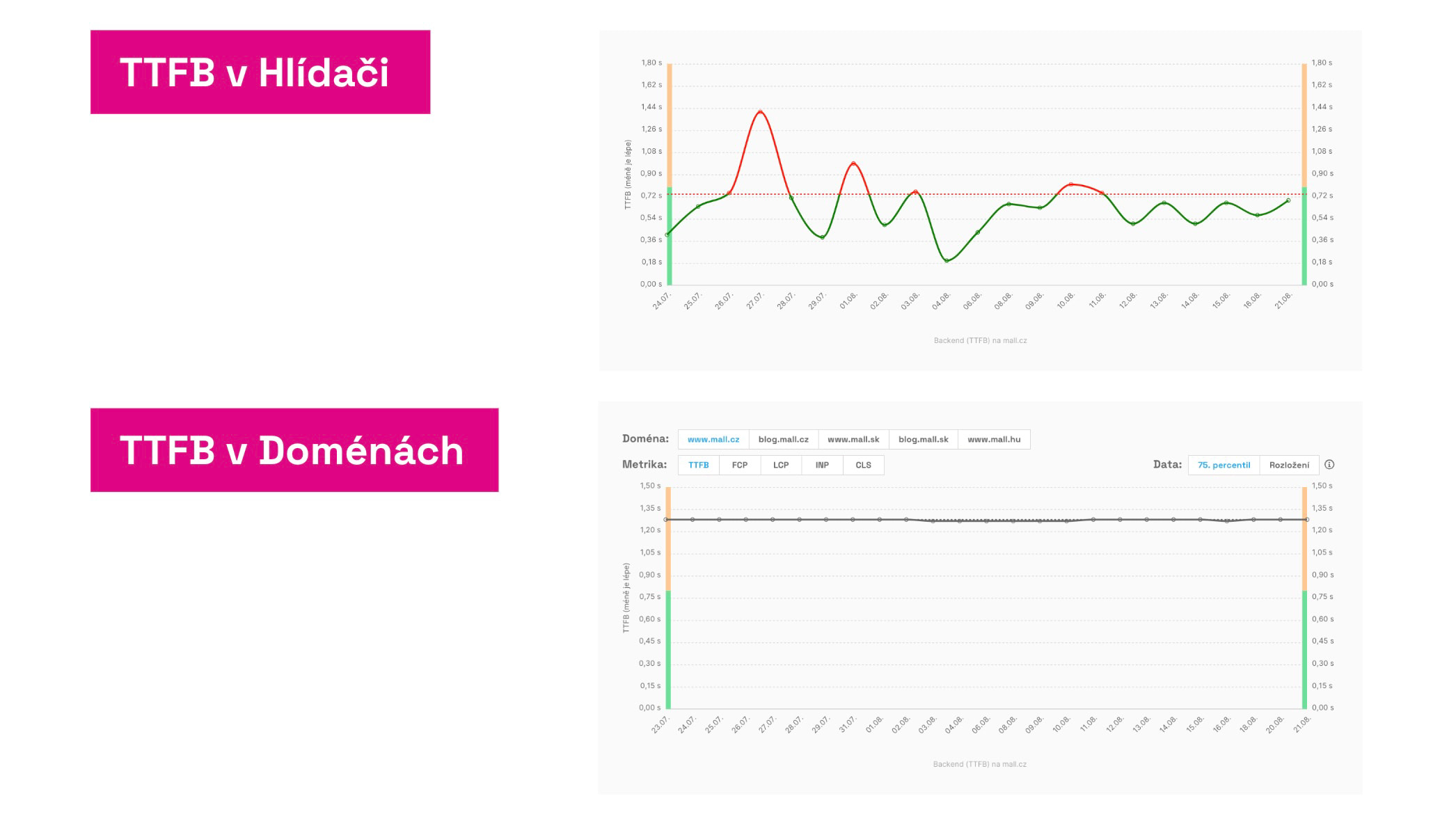 Same metrics, different results. Why?
Watchdog shines at quickly flagging metric changes. The true state, however, should be verified in the Domains report, which shows CrUX data from users. These are displayed cumulatively over the last 28 days, which isn’t ideal for the daily notifications we send from Watchdog.
That’s why we need both a fast Watchdog and an accurate Domains report.
Specific charts in the Domains report and how to use them
User measurements for domains
The first chart shows the current state of metrics for a specific device type (mobile or desktop) and any movement toward improvement or decline:
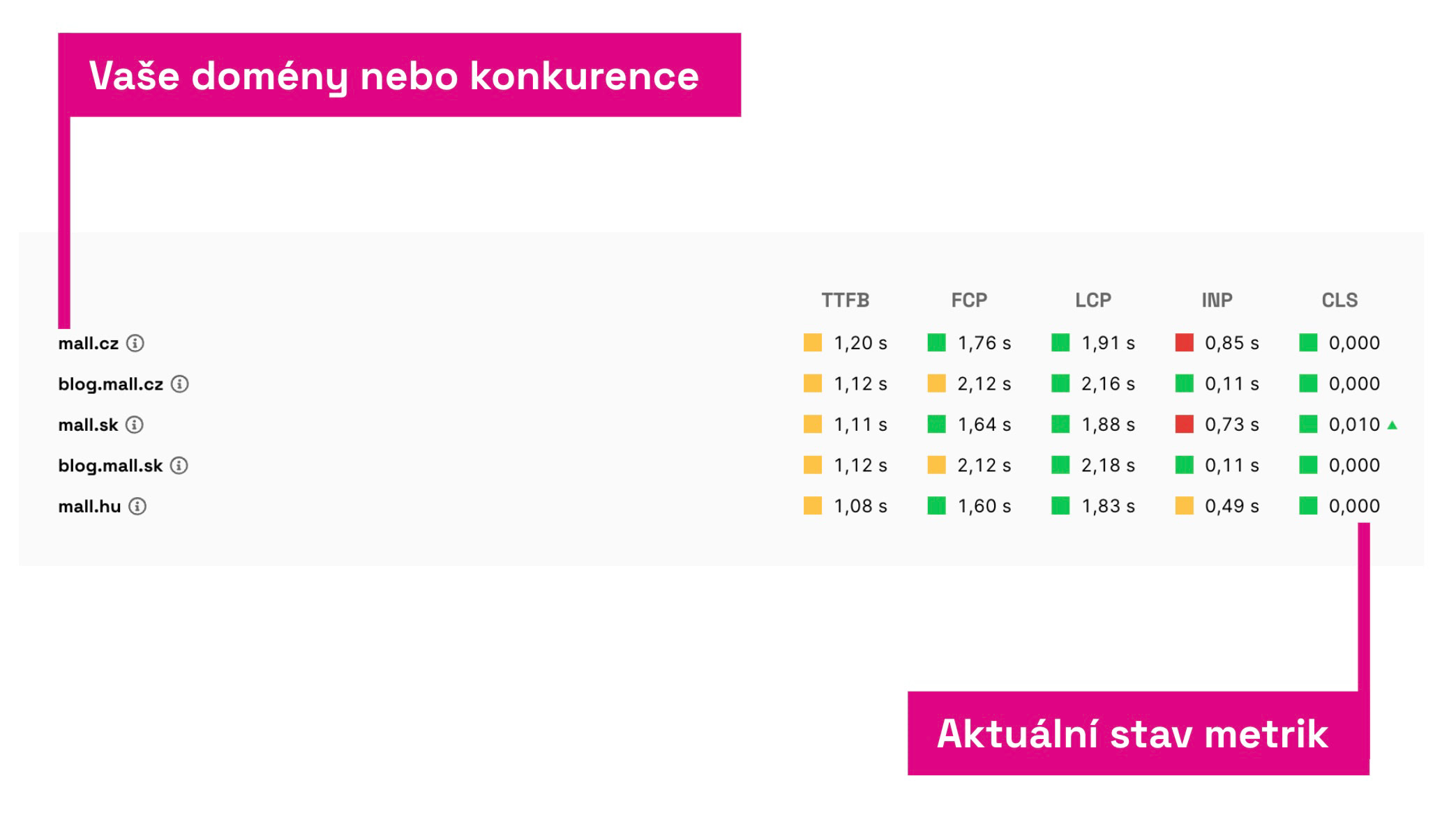 Here you see data from Google, from the Chrome UX Report.
We cover both Core Web Vitals metrics (LCP, INP, CLS) and supporting metrics — TTFB and FCP.
In the table you can see how you compare to competitors or to other domains you own.
Red or green triangles next to numbers indicate larger changes versus the previous month. Metrics marked this way deserve close attention.
Evolution of user metrics over time
The next chart shows metric evolution over time:
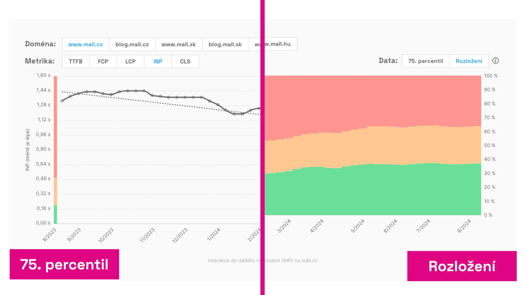 Two views of user data: the 75th percentile value and the distribution of three value types.
As with other speed-monitoring charts, you can choose how to display the data:
- 75th percentile — Google uses this value to assess Core Web Vitals for the entire domain. Side indicators show whether the value sits within recommended (green), needs improvement (orange), or is poor (red) ranges.
- Distribution — See the percentage share of different metric values across all users. Here too you can see what portion meets the metric (green), needs improvement (orange), or is poor (red).
Note that, in both cases, data are 28-day cumulative. “Cumulative” means the current day’s value is the 75th percentile of the 28 days’ data, not a snapshot of today.
Major shifts won’t appear immediately; they unfold gradually over about a month. Even small changes can signal a larger movement in the metric.
How to use this chart? In PageSpeed.cz’s advisory team this is the chart we monitor most. If you deploy optimizations, you may see positive changes within days. We primarily track the metric value, but if it’s stable, we also watch how the distribution evolves.
Domain speed by month
Another set of charts shows metric values by month rather than by day:
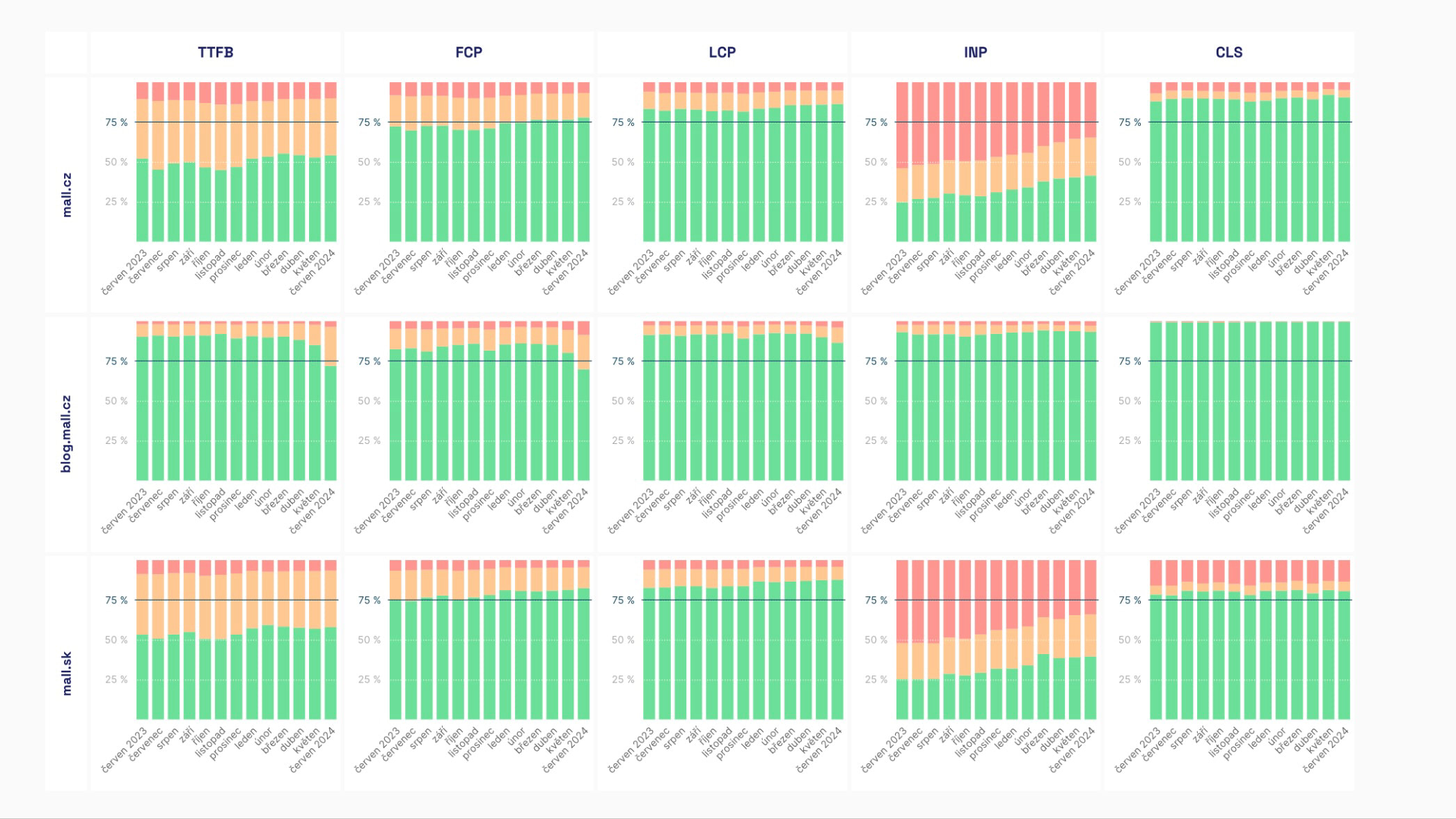 The domain speed by month is a colorful chart. The more green, the faster the domain.
In these charts you can choose to view either the metric value (75th percentile) or the distribution of green, orange, and red values.
You will see:
- The evolution of Core Web Vitals metrics (LCP, CLS, INP) and others (FCP, TTFB).
- The evolution of navigation types (see also the graph below).
The data here provide a long-term view and come from the CrUX data in BigQuery, where the numbers are stored after cleansing.
We treat this graph as a managerial view over a longer horizon, indicating whether your speed optimizations are succeeding.
Navigation Types show how users arrive at pages on a given domain.
The goal is to maximize instant navigations such as “prerender”, “navigate_cache” and “back_forward_cache”.
🔐 This report is available only to PLUS Tests users.
How to interpret this graph? Here’s an example:
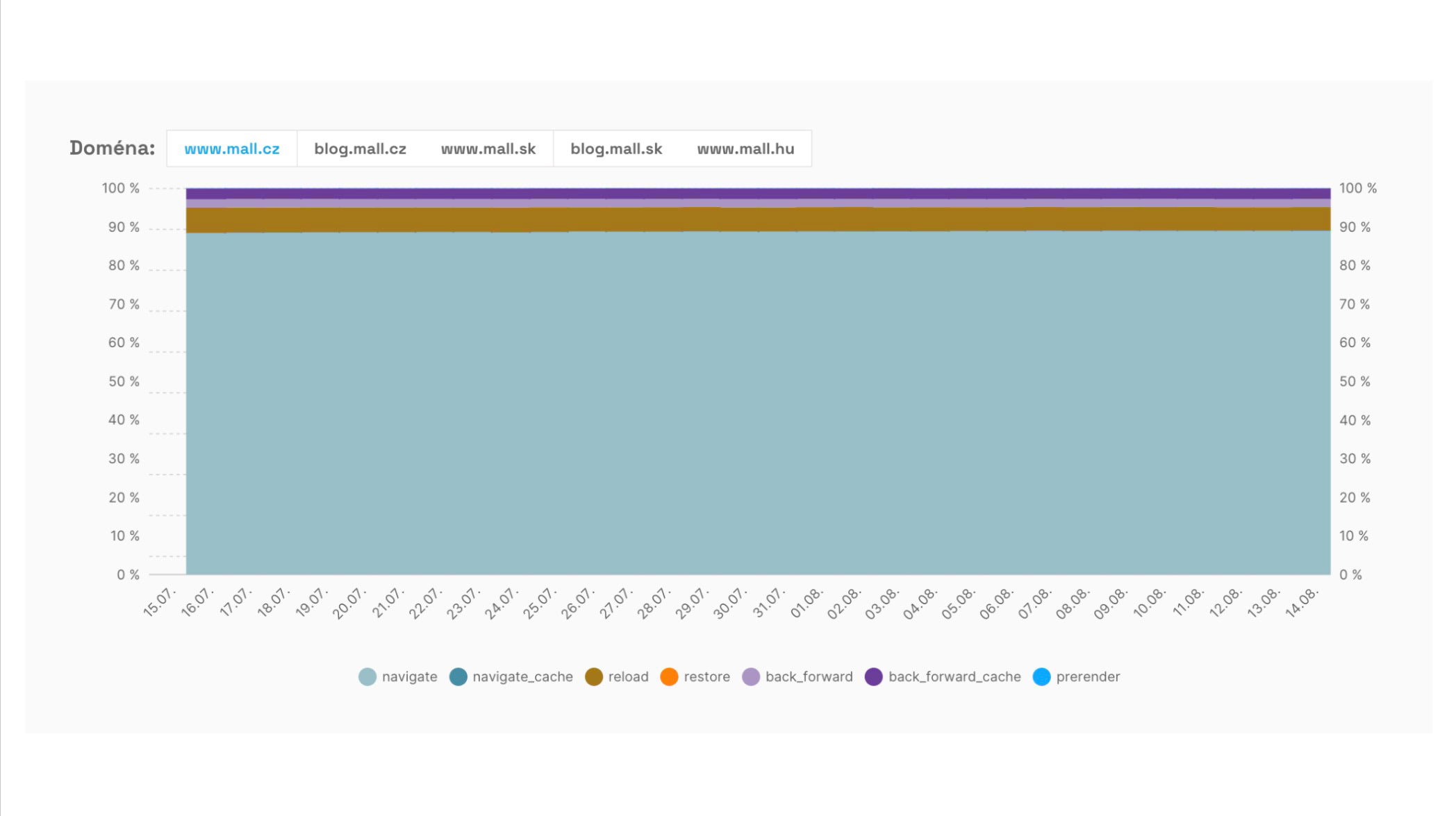 Share of different navigation types when visiting www.mall.cz.
We see a large share of regular navigations via “navigate” (light blue) and then “reload” (brown). Those approaches are the most common. What other opportunities exist?
We see that the balance between ordinary browsing navigation (“back_forward”) and loading from cache for instantaneous history (“back_forward_cache”) is roughly even. Ideally, most navigations in history should occur from the cache.
There’s also notable potential in the “prerender” instant navigation, currently driven mainly by the Speculation Rules API, across the remaining visits. This represents a big opportunity for Mall.cz to implement prerendering and improve the metrics.
There’s also a chance to load documents from the browser cache (“navigate_cache”). Mall.cz, like many sites, restricts pages from being cached by the browser.
Summary
Let’s recap the Domains report:
- This is one of the most important reports in our monitoring. It lets you track CrUX metric values for all measured domains.
- In addition to the current state, you can see daily changes (great for monitoring the impact of specific changes) and monthly trends to gauge progress in speed optimizations.
- The Navigation Types report shows where you can leverage instant navigations.
For URL-level performance details, refer to the [Pages] report and the [Watchdog] report for daily metric feedback on your URLs.