Cumulative Layout Shift (CLS) Metric: How to Find and Eliminate Unwanted Page Shifts
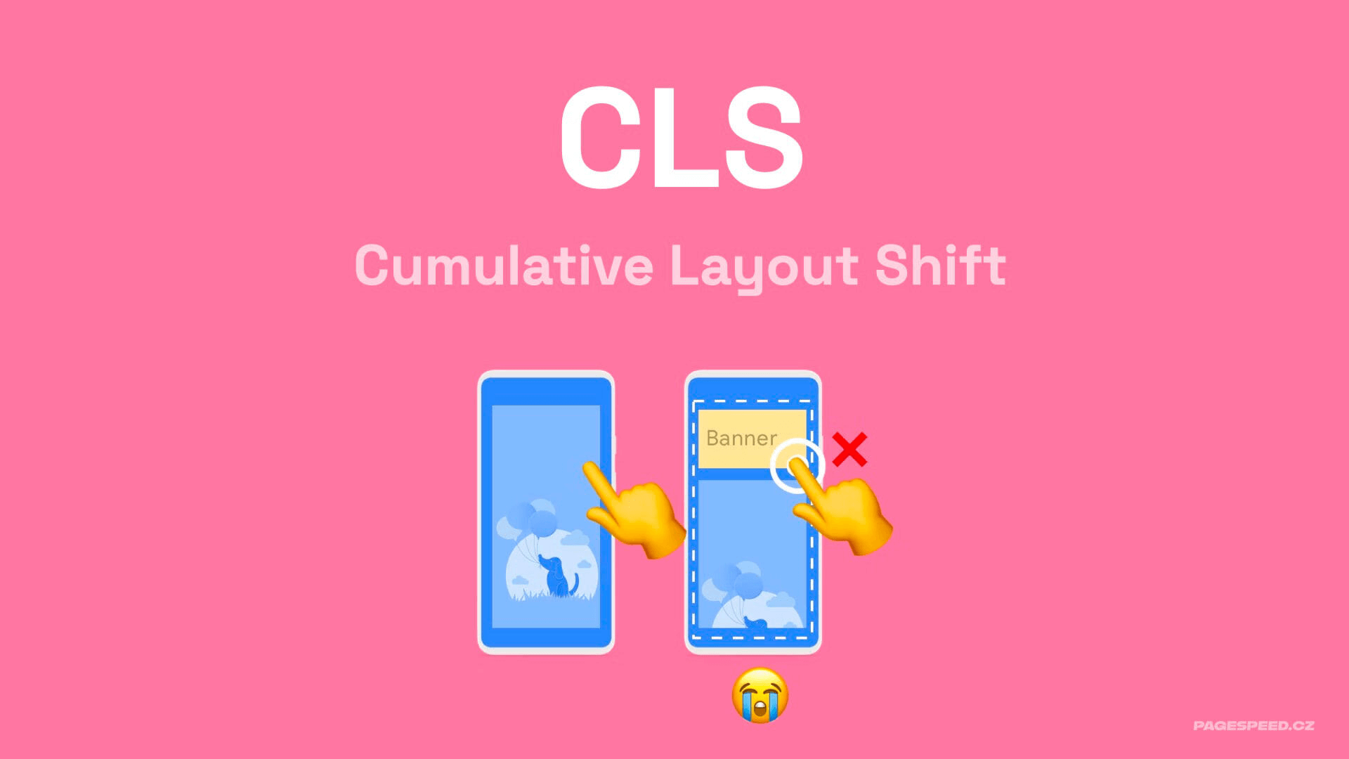
Do ads on a website push the text you’re reading out of view? Frustrated when content shifts just before you click and you end up clicking somewhere else by mistake?
These unwanted moments on the web are called layout shifts. All shifts on a single page are captured by the Cumulative Layout Shift metric, or CLS.
Let’s take a deeper look at this metric.
Getting to know CLS
The goal of CLS optimization is to ensure the highest possible visual stability during rendering and as users interact with the page. This helps users consume content more easily.
Technically, CLS is defined as the sum of layout shifts within the worst five-second window during a page visit.
This metric is part of Core Web Vitals, used by Google to measure the quality of web pages. Core Web Vitals are also one of the signals considered in search ranking.
The threshold for CLS
To keep CLS in the green, good range, the metric should be ≤ 0.1. If you achieve this, you’re winning.
A CLS of 0.1–0.25 sits in the orange band and needs improvement.
If measurements from users show CLS above 0.25, Google will rate your CLS as unacceptable.
| Good | Needs improvement | Poor | |
|---|---|---|---|
| CLS | < 0.1 | 0.1 – 0.25 | > 0.25 |
The importance of a good CLS score
CLS can matter for your site in several ways:
- CLS influences SEO and ad value by being part of Core Web Vitals.
- Optimizing CLS increased Yahoo! JAPAN News page views per session by 15%. See the case study on Web.dev.
- Mail.ru achieved a 10% increase in conversion rate by optimizing this metric; see the study.
- CLS also affects Lighthouse scores. Since Lighthouse v10, CLS contributes 25% to the overall score (LPS), alongside metrics like LCP.
Some of our clients have seen traffic gains after CLS optimization as well.
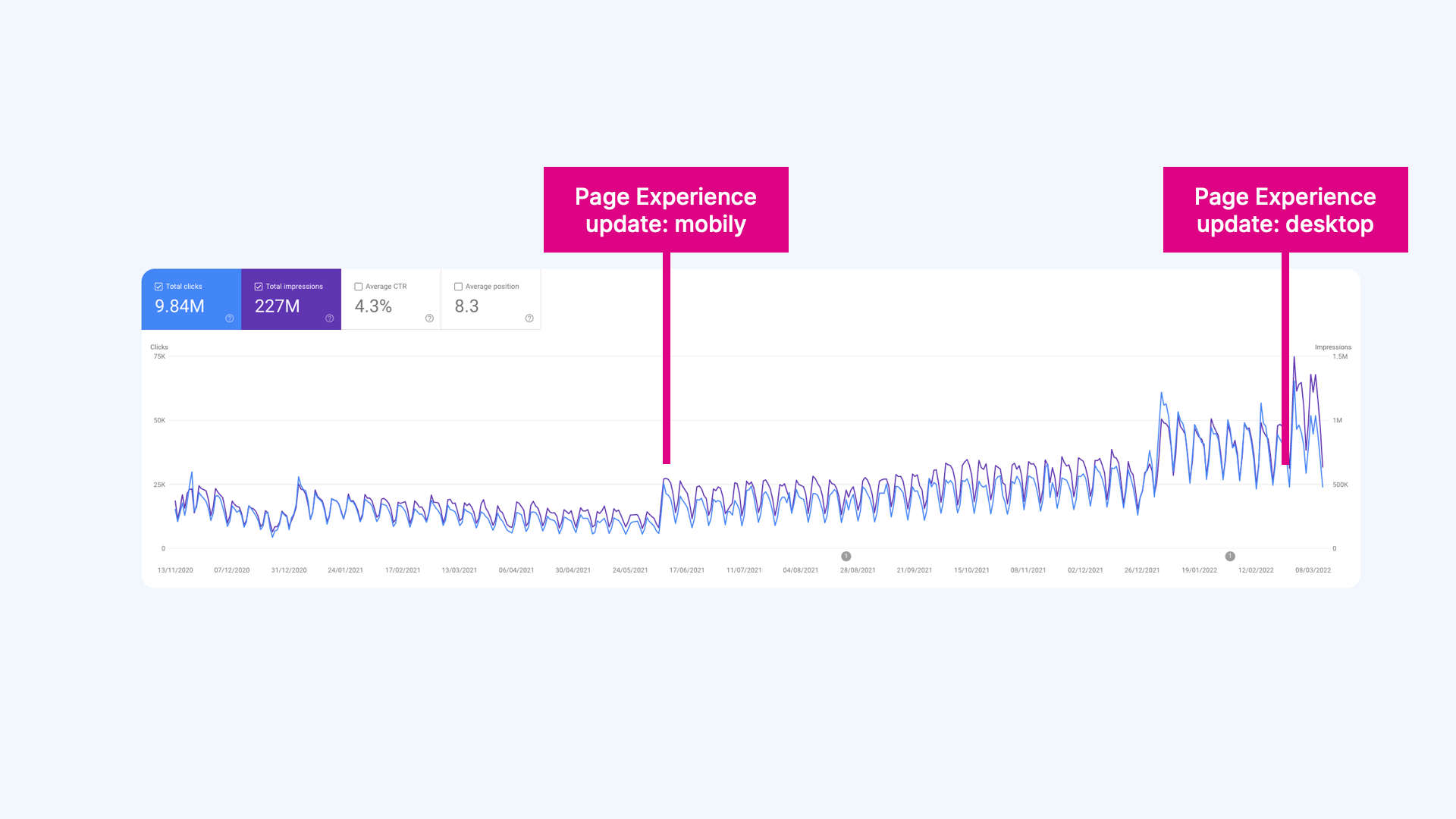 On one content site, we achieved green Core Web Vitals post-optimization. After Google's Page Experience update, traffic rose significantly.
How CLS is calculated exactly
First, let’s define what one layout shift entails.
 Cumulative Layout Shift
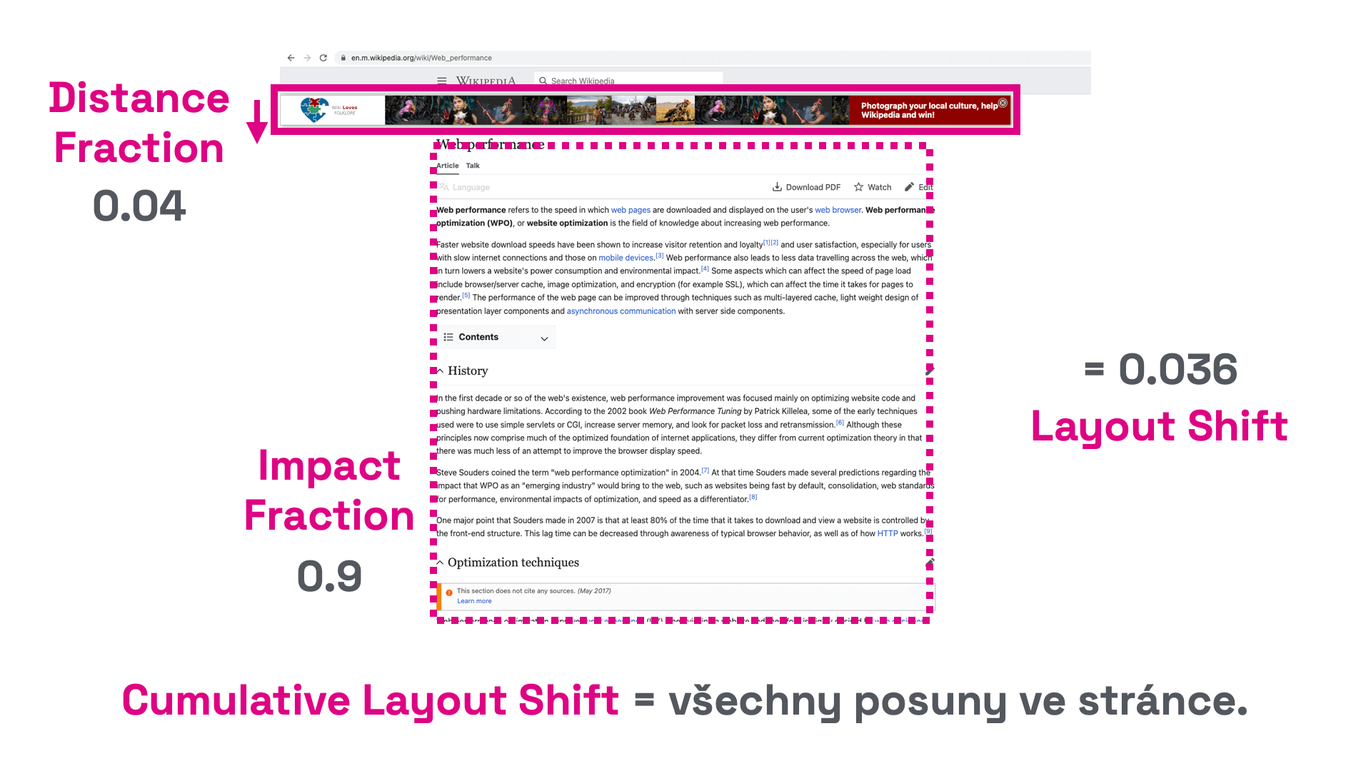
- Individual layout shifts are calculated from the impacted area (Impact Fraction) and the distance the unstable element moved (Distance Fraction) along the X and Y axes.
- In the example below, the unstable element occupies roughly 90% of the viewport.
- The element shifted by 4% of the viewport height. The shift distance is therefore 0.04.
- The impacted area is 0.9 and the shift distance is 0.04.
- The layout shift is 0.04 × 0.9 = 0.036.
There can be multiple such elements on a page, which is why the metric is called “Cumulative.”
Tip: Why have a fast website? It can boost your conversions and traffic.
The session window
Remember that CLS is measured across the entire session in Chrome UX Report. However, the overall CLS score is limited to the worst CLS observed within a 5-second session window. In short: take the five seconds with the worst results.
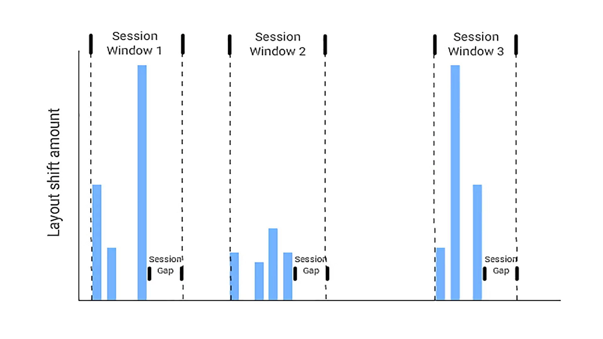 CLS is calculated by taking a single, worst window.
- Unwanted shifts—layout shifts discussed above—are counted in session windows up to five seconds long.
- If a second passes with no shifts, the window ends earlier than five seconds.
- Across the entire visit to a specific URL, only the worst window is used as the CLS score for that page.
This per-session approach helps prevent inflated CLS values for long visits on a single URL.
For more on CLS measurement, visit web.dev.
How CLS actually occurs
In practice, the main culprits behind CLS are:
- Shifts caused by progressively loading content where elements lack predefined sizes, such as images or JS components.
- Bad animations and shifts driven by CSS properties. Avoid animations that don’t use transforms.
- Not delivering requested changes within 500 ms. If you can’t redraw content quickly, reserve space for new content, e.g., for AJAX pagination.
 Watch out for asynchronously loaded elements like images—they’re prone to shifting.
Measuring CLS
Chrome UX Report
Ideally, collect CLS data from nearly all visitors via the Chrome UX Report. For your domain, it returns the 75th percentile CLS across page views. The data cover Chrome on desktop and mobile; they don’t include measurements from Apple devices.
Chrome UX Report data are available in tools like PageSpeed Insights, our PageSpeed.cz tester, or Google Search Console.
Chrome DevTools
A great option for developers is measuring CLS locally. Measure per page. Use Chrome with the Web Vitals extension to start measuring right away.
Begin by measuring CLS in the first viewport, then continue with interactions like scrolling and clicking.
PageSpeed Insights or Lighthouse
PageSpeed Insights or Lighthouse measure CLS on individual pages in the first viewport. It’s a good starting point for tuning core layout elements, menu shifts, mobile header, and banners around the site.
The drawback is that they measure CLS only in the first viewport—we want to measure cumulative shifts.
Concrete recommendations to avoid layout shifts
From our hands-on experience with web speed consulting, here are a few recurring issues:
Always specify sizes for images and asynchronous elements
Ensure all images have defined width and height via the width and height attributes. Asynchronous elements like JS components or ads can use the CSS aspect-ratio property.
Don’t load external components without placeholders
Before initializing ad systems or social plugins (Facebook, Instagram, TikTok), reserve space with a placeholder or via aspect-ratio. Choose placeholder dimensions to reserve an area similar to the content generated by the plugin.
Use BFCache
Enable BFCache to reduce CLS on your site. When navigating through history, the browser can serve pages from memory, avoiding re-renders and shifts. This cache has long been around, and since 2023 Chrome on mobile and desktop supports it.
Fine-tune your own fonts
Replacing system fonts with custom fonts often causes CLS. A few guidelines:
- Fewer font weights and variants are better.
- Start font loading as early as possible.
- Use preload to prioritize font loading.
- Use only modern WOFF2 format.
- Ensure text remains legible before the external font loads with font-display.
- Use size-adjust to harmonize the external font with the fallback system font.
Respond to on-demand shifts within 500 ms
If a click triggers a partial page redraw and the new content has different dimensions, you must handle the shift within 500 ms. This applies to AJAX pagination. If you can’t reliably deliver the new content within this window on slower devices, adjust surrounding elements first and insert the real content later.
Place CSS in the head
Keep CSS in the head so styles are parsed and applied promptly. Adding more CSS rules inside the HTML can cause additional layout shifts as styles are parsed.
Reserve space for icons
If you use an IconFont or an SVG sprite with many icons, the large file can take longer to load. Icons will appear only after the file loads, potentially shifting content. Always define icon dimensions before loading.
Animate only with transforms
CSS transforms allow animating elements without layout shifts. Prefer transform: scale() to change size, and avoid changing top/right/bottom/left—use transform: translate() instead to move elements.
Final tip: Case study on CLS optimization for our client Goldea.cz by Martin Michálek from Webexpo 2023.
Bonus: watch out for scrollbars
If you measure CLS at 1.00 right after page load and aren’t sure what else to optimize, try overflow-y: scroll. As HTML and CSS files are parsed, the vertical scrollbar can be toggled on and off, causing extra shifts.
Add this to your CSS:
html { height: 100%; overflow-y: scroll; }
CLS is part of our unified speed metric — the PageSpeed.cz score (SPS).
We also cover CLS optimization in a dedicated article.
We can help with CLS
On the SIKO website, we managed to improve layout stability sevenfold. Site speed is crucial for SIKO, but their new JavaScript-heavy frontend had notable Core Web Vitals issues.
Tags:MetricsCore Web VitalsCLSCrUX
PreviousThird-Party Blocking (3PBT)NextCore Web Vitals (CWV)